Graphic design notes
8/25/15
1. We have no choice but to be drawn to images. Our brains are beautifully wired for the visual experience. For those with intact visual systems, vision is the dominant sense for acquiring perceptual information at rapid speed. We have a surprisingly large capacity for pictures memory, and can remember thousands of images with few errors.
2. We are also compelled to understand images upon viewing a visual, we ask "What does it mean?" Our minds need to make sense of the world, and we do so actively. To scan and search our memory stores, to call forth associations and emotions,and to use what we already know to interpret and infer meaning on the unknown.
3. acquiring a sense of our innate mental and visual capacities can enable GD and illustrators to express their message with accurate intent . for example, if ones goal is to visually explain a process, then understanding how humans comprehend and learn helps the GD create a well defined info graphic.
4. if ones purpose is to evoke a passionate response, then an understanding of how emotions are tied to memory enables the designer to create a poster that sizzles. if ons purpose is to visualize data,then understanding the contains
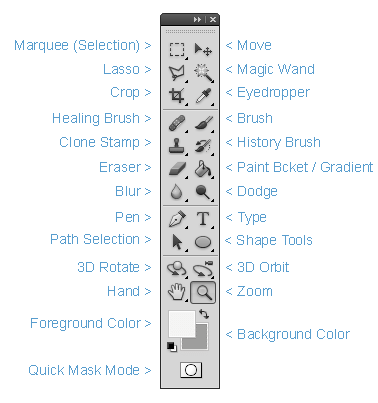
5. (iLL notes) black arrow =main selection tool, white
shapes dotted circle = rotate gradeant =
color fading , crop -working area/ adds crop marks hand = move around (spacebar), Zoom = 1-100%
(spacebar+command), full page=command+0 pen tool=one of the most useful tools for making any victor art. CNTRL + semi colon =guides of/on
7.our neurons seem to be plugged in to the digital stream , having adjusted to the continual barrage of visual info. with multiple windows scrolling text new media dig imagery video on demand ad banners and pop ups we have come to appreciate the fact that visuals reduced the time it takes for a viewer to understand and respond to info. The sheer quantity visual messages relayed through new tech has lead some to call imagery'' the new public language ''
8.take a pic of ur sketch 2.tame ur ruller ad it won't slide 3.use o sharpie pen on the edges of a black peace of paper so it won't bleed through 4.consider ur back round color 5. try out google color
9. iLL tips 1. change the color of the path so u can se it better 2. live tracke, you can improve the image in PS 3. go to PREFS to change the line stroke settings 4.type to thin stroke to it 5. color search LIBS have many more options 6. ILL & PS are use for very different reasons
10. FONTS 1. serifs and sans serifs little feer and not feet 2 .x height = lower case letters 3. do all of the letters in the fot work 4. how dose the body copy loos 5 . dose it
11.visual communcation is fitting for a multilingual, global,culture, using basic design elements, its possible to bypass differences in symbol reception and language to convvey our message through imagery said V.C. is universal and international it knows no limits to tongue vocabulary or grammar and it can be perceived by the thing.
12 communication through imagery has other advantages as well , to explain something hidden from view, such as the mechanics of a machine or the human body a cross section of the object or a transparent human figure works well when we need to describe an invisible process, such as how a text message is transmitted , iconic forms interconnected.
13 system of standard papersize A = series covers stationary and book B = series intermediate range C= series is for
14 agha , mehemed fehmy (1896-1978) mag covers
15 aicher, otl (1922-91) german designer and typographer who led the visual group of the 1972 olympic games munich
16 Airbrush = painting implement, resembling a large fountain pen, which is powered by compressed air to produce a finely controlled spray of paint or ink. successful airbrushing depends on the skillful application and then removal, of cutout adhesive masks which ensure the spray of color is accurately directed at the area left exposed Airbrushing is a technique cable of great subtle of great subtle in tonally graded effect
17. albers, josef (1888 - 1976) 1. german artist, designer, and educator who developed theories relation to the emotional and perceptual impact of color, line and geometric forms. his BAUHAUS principles influenced generations of design students
+++ ILLUSTRATOR NOTES:+++
- Black arrow equals your main selection tool.
- White arrow is for making certain or small selections.
- T type, line and shapes, dotted circle= rotate.
- Gradient = value/ color, fading
- Crop = working area/ adds crop marks
- Hand = move around ( spacebar )
- Zoom = 1-100% ( Spacebar+Command+0)
- Pen Tool = one of the most useful tools for making any vector art
5 Principles of Graphic Design- Alignment creates a sharper, more ordered design. Aligning elements allows them to create a visual connection with each other. It tightens the design and eliminates the haphazard, messy effect which comes when items are placed randomly.
Aligning elements which are not in close proximity with each other, helps to provide an invisible connection between them.
Alignment is one of the most basic and important principles of design. It allows us to create order and organisation among elements.
- Repetition strengthens a design by tying together individual elements. It helps to create association and consistency.
The consistent repetition of an element is widely used in multi-page documents & websites. Elements can be as simple as colour, shapes, typefaces or even texture.
- Contrast allows you to emphasize or highlight key elements within your design. Contrast is created when two elements are total opposites. This doesn’t necessarily have to be colours either. It can be achieved with fonts (classic/contemporary), lines (thick/thin) and shapes (big/small), just to name a few.
Contrast plays a crucial part in the organisation of information on a page. It will guide the reader to where they should look first or to the most important element. For it to work successfully though, it must be strong and obvious. It needs to make an impact.
- Proximity helps creates organisation. By grouping similar elements together or in close proximity, you create a relationship between those elements. It also provides a focal point and can give the reader and idea of where they should start and finish reading.
Proximity doesn’t mean that elements have to be placed together, it means they should be visually connected in someway. This can be by use of point size, font, colour etc…
- Balance provides stability and structure to a design. It’s the weight distributed in the design by the placement of your elements. The elements don’t necessarily need to be of the same size. Balance can be achieved by placing a large element on one side of your design and several small elements on the other side.
Balance can be achieved in 2 ways, either Symmetrical or Asymmetrical.
Symmetrical balance is achieved when the weight of the elements on both halves of the design is even, given a centre line. Asymmetrical balance is achieved by the use of contrast. A dark element would need to be balanced by several lighter elements.
Stop Stealing Sheep:
Illustrator:
5. (iLL notes) black arrow =main selection tool, white
shapes dotted circle = rotate gradeant =
color fading , crop -working area/ adds crop marks hand = move around (spacebar), Zoom = 1-100%
(spacebar+command), full page=command+0 pen tool=one of the most useful tools for making any victor art. CNTRL + semi colon =guides of/on
7.our neurons seem to be plugged in to the digital stream , having adjusted to the continual barrage of visual info. with multiple windows scrolling text new media dig imagery video on demand ad banners and pop ups we have come to appreciate the fact that visuals reduced the time it takes for a viewer to understand and respond to info. The sheer quantity visual messages relayed through new tech has lead some to call imagery'' the new public language ''
8.take a pic of ur sketch 2.tame ur ruller ad it won't slide 3.use o sharpie pen on the edges of a black peace of paper so it won't bleed through 4.consider ur back round color 5. try out google color
9. iLL tips 1. change the color of the path so u can se it better 2. live tracke, you can improve the image in PS 3. go to PREFS to change the line stroke settings 4.type to thin stroke to it 5. color search LIBS have many more options 6. ILL & PS are use for very different reasons
10. FONTS 1. serifs and sans serifs little feer and not feet 2 .x height = lower case letters 3. do all of the letters in the fot work 4. how dose the body copy loos 5 . dose it
11.visual communcation is fitting for a multilingual, global,culture, using basic design elements, its possible to bypass differences in symbol reception and language to convvey our message through imagery said V.C. is universal and international it knows no limits to tongue vocabulary or grammar and it can be perceived by the thing.
12 communication through imagery has other advantages as well , to explain something hidden from view, such as the mechanics of a machine or the human body a cross section of the object or a transparent human figure works well when we need to describe an invisible process, such as how a text message is transmitted , iconic forms interconnected.
13 system of standard papersize A = series covers stationary and book B = series intermediate range C= series is for
14 agha , mehemed fehmy (1896-1978) mag covers
15 aicher, otl (1922-91) german designer and typographer who led the visual group of the 1972 olympic games munich
16 Airbrush = painting implement, resembling a large fountain pen, which is powered by compressed air to produce a finely controlled spray of paint or ink. successful airbrushing depends on the skillful application and then removal, of cutout adhesive masks which ensure the spray of color is accurately directed at the area left exposed Airbrushing is a technique cable of great subtle of great subtle in tonally graded effect
17. albers, josef (1888 - 1976) 1. german artist, designer, and educator who developed theories relation to the emotional and perceptual impact of color, line and geometric forms. his BAUHAUS principles influenced generations of design students
+++ ILLUSTRATOR NOTES:+++
- Black arrow equals your main selection tool.
- White arrow is for making certain or small selections.
- T type, line and shapes, dotted circle= rotate.
- Gradient = value/ color, fading
- Crop = working area/ adds crop marks
- Hand = move around ( spacebar )
- Zoom = 1-100% ( Spacebar+Command+0)
- Pen Tool = one of the most useful tools for making any vector art
5 Principles of Graphic Design- Alignment creates a sharper, more ordered design. Aligning elements allows them to create a visual connection with each other. It tightens the design and eliminates the haphazard, messy effect which comes when items are placed randomly.
Aligning elements which are not in close proximity with each other, helps to provide an invisible connection between them.
Alignment is one of the most basic and important principles of design. It allows us to create order and organisation among elements.
- Repetition strengthens a design by tying together individual elements. It helps to create association and consistency.
The consistent repetition of an element is widely used in multi-page documents & websites. Elements can be as simple as colour, shapes, typefaces or even texture.
- Contrast allows you to emphasize or highlight key elements within your design. Contrast is created when two elements are total opposites. This doesn’t necessarily have to be colours either. It can be achieved with fonts (classic/contemporary), lines (thick/thin) and shapes (big/small), just to name a few.
Contrast plays a crucial part in the organisation of information on a page. It will guide the reader to where they should look first or to the most important element. For it to work successfully though, it must be strong and obvious. It needs to make an impact.
- Proximity helps creates organisation. By grouping similar elements together or in close proximity, you create a relationship between those elements. It also provides a focal point and can give the reader and idea of where they should start and finish reading.
Proximity doesn’t mean that elements have to be placed together, it means they should be visually connected in someway. This can be by use of point size, font, colour etc…
- Balance provides stability and structure to a design. It’s the weight distributed in the design by the placement of your elements. The elements don’t necessarily need to be of the same size. Balance can be achieved by placing a large element on one side of your design and several small elements on the other side.
Balance can be achieved in 2 ways, either Symmetrical or Asymmetrical.
Symmetrical balance is achieved when the weight of the elements on both halves of the design is even, given a centre line. Asymmetrical balance is achieved by the use of contrast. A dark element would need to be balanced by several lighter elements.
Stop Stealing Sheep:
- A newspaper gets its look, its personality, from the typefaces used and the ways in which it is arranged on the page.
- In North America something may look unacceptable, but would please a French reader.
- Not every typeface is suited for ever language, certain faces are popular in certain countries.
- Newspapers require careful planning and are laid out with complex grids.
- Design- in this case at least has to be invisible. Typefaces have to look normal so that you don't even notice that you're reading them.
- Every PC user today knows what a font is, calls at least some of them by name; Helvetica, Verdana, Times. What we see on screen are a little unconnected square dots.
- In ancient Rome letters were drawn by brush on stone and then chiseled out.
- GD and typography are complicated, but even simple projects benefit from thinking about the problem, forming a mental picture of the solution, and carefully planning the steps.
- Typefaces were designed 500 years ago around the time of moveable type. These basic shapes and proportions are still valid today.
- There are thousands of variations of the letters that have been created, Typefaces for reading are derived from handwriting.
- As literacy spread people began to care more about expressing their thoughts quickly, and less about style and legibility.
- Quills, pens, pencils, etc. have all changed handwriting, but he Roman alphabet has survived all of these remarkably intact.
- Our view of things is still largely shaped by nature plants, animals, weather, scenery. Most of what we perceive as harmonious and pleasing to the eye follows the rules of proportion that are derived from nature.
- Our classic typefaces also conform to those rules; if they don't, we regard them as strange.
- TV, web, phones,etc. put to question our "natural rules" of perception.
- Th world of typefaces is bound to change more by 2020 than it has since the 15h century.
- HEADLINES= have to be big and at the top.
- NEWSPAPER TYPE= has created some of the very worst typefaces, typesetting, and page layouts known to man kind.
- BOOKS TYPE= hasn't changed much over the last 500 years.
- "Classic" Typefaces; Caslon, Baskerville, Garamond.
- An overall impression is created in our minds before we even read the first word.
- Graphic designers, typesetters, editors, printers, etc. follow the rule that "it is best to follow the rules" but at times they need to be broken.
- Good designers learn all the rules before they start breaking them.
- Type has practical uses- it can walk run skip climb and dance. It can express emotions.
- Personality of type can be light or heavy, round or square, slim or squat.
- Dark emotions all for a black face-type with sharp edges, pleasant feelings are best evoke by informal and light.
- The best casual typefaces have always had some spontaneity of handwritten letters into mechanical restrictions.
- The more characters in a word, the more chances there are to find the right letterforms to express its meaning.
- Type and graphic designers often to choose typefaces for reasons of "beauty" "ugly" etc.
- For more scientifically minded people there are measurements for type
- Components, details, proportions. to describe various parts of the letter.
- X- height, descenders, cap height, etc.
- Metal letters can be made for any width and height but digital type has to conform to pixels.
- On screens 72 pixels = one inch
- Typographic variety cannot be suppressed by technological restraints
- Picking typefaces for design job is similar to packing clothes for a trip.
- Before you pick your font family, you need to look at the task ahead. Get a balance between practical and aesthetics. That is what design is all about.
- Pick typefaces for reading that are easy to read.
- Loose fit. is a typesetting term that means letters have a comfortable space between them.
- Italic style came from many years ago when scribes had to write hundreds of pages every day.
- We read best what we read most...
- Most type is used for business communication of one sort or another so it has to conform to the rules of the corporate world.
- Text for business has to look fairly serious
- Faces such as Times New Roman and Helvetica fit this bill perfectly due to lacking individualism.
- Technical professions use a cooler and more rigid type.
- Traditional trades use more classic types.
- HARDWORKING TYPE has: 1. A good regular weight. 2. At least one bold weight. 3. very legible measurements. 4. Economy- should be narrow and fit into small spaces.
- There are typefaces that are only suitable for more occasional occasions,
- They may be to hip to be used or mainstream communication or too uncomfortable
- FUN FONTS= more entertainment than corporate fonts, fun to work with.
- When you print on aper your choice of a typeface is covered first by the content of the message then the audience and then technical restraints.
- CMYK= cyan, magenta, yellow, black
- RGB= red, green, blue ( this is normally used in screens.)
- Human's eyes do not like light coming out of screens while they are reading.
- The way book are read hasn't changed much over 500 years, only the economics, which means fitting more onto a page.
- Generic Ad style = headline on top, attention grabbing picture, sub head, main copy, logo, address, url, phone number. (Never more than 8 elements).
- The computer has given us access to the design language that would have been far too complicated without the aid of sophisticated programs.
- Gradations of color, overlaid images, frames, lines, boxes, back/ foregrounds, all add up to the appearance of the page as one image.
- The waves may come and go, but G.D. will always be about problem solving first, and style making afterward.
- Corperations have tons of money so they hire designers and ad agencies
- swome designers set trends and other designers follow the trends. They all get paid to make thier clients look different from the competition.
- Type and Design enhances and helps reinforce a message.
Illustrator:
- The absolute first thing you should know about illustrator is that it is used to create vector graphics.
- Vector graphics are very different than the raster graphics that you typically create in Photoshop (it is true that Photoshop has some limited vector capabilities, but no where near what you can achieve in Illustrator.). Instead of being comprised of static individual pixels, vector graphics are mathematically drawn by your computer and therefore can be drastically changed with absolutely zero loss in quality.
- The first thing that you are likely to notice when you start using illustrator is that there is a whole lot of stuff going on when you select and edit something. This is something that lots of new users tend to hate right off the bat because it looks confusing, but in reality all of the information and controls that Illustrator throws at you are extremely helpful.
- The bounding box: Whenever you select anything, you'll see its bounding box. This is an intuitive feature that you should instantly understand, the part that's not intuitive is why it won't go away.
- In Photoshop you only see an object's bounding box when you're in the midst of a transform. In illustrator, you see the bounding box whenever you have a complete object selected and the active tool is the Direct Selection Tool.(V)
- If you have multiple objects selected, the bounding box will appear around all of them, allowing you to move or transform together. The same rules apply as you're used to in Photoshop: hold shift key to scale uniformly, throw in the Alt/Option key to scale from the center,etc.
- The difference is you can't grab and independently move a specific corner of the bounding box like you can in Photoshop transform. This makes shearing and putting perspective on objects a bit trickier.
- When switching from Photoshop to illustrator, it's important to note the conceptual changes in the workflow. Despite the fact that the two applications share so many features, it's frequently the case that the feature is used in a very different way.
- In Photoshop, every piece gets its own layer. In fact, every individual object is really defined by the layer it's on. If you throw elements on the same layer, they become a single element and if they overlap you won't be able to separate them anymore.
- On the right side palette you should see a circle next to a colored square. Clicking on that circle allows you to easily select an element. Click on that layer's circle to select everything within the layer or an individual element's circle to select only that item.
- Smart Guides: Allow you to size objects on the fly using precise measurements and align whatever you have selected with points and lines from other objects around it. they make it really easy to create complex layouts very quickly and are much easier than "eyeballing".
- You also have a full set of alignment tools for these types of operations.
- Pathfinder: As with most professional vector software, Illustrator makes creating complex shapes much easier through the use of Boolean operations found in the Pathfinder palette.
- You can create as many artboards as you want in a single document. Functionally there are a lot of different benefits to using multiple art boards within a single document. you can easily move/copy objects back and forth and print or export selected artboards all at once.
- Bleed= ink that is printed directly to the edge.
- Crop Marks= corner marks for the printer to know where to trim the paper.
- Illustrator= vector art making.
- Best program for logos, pen tool, etc.
- Photoshop= pixel art making.
- Best program to alter photos.
- Elements of design are the basic units of a visual piece.
- C.R.A.P. - Contrast, Repetition, Alignment, Proximity
- Less is more. Nothing is placed on a page my accident or coincidence.
- Contrast: Negative space is good because it makes the design easily visible
- Repetition: Ties the design together. Makes it a broader visual.
- Alignment: Everything should have a visual relationship with other elements.
- Proximity: Grouping similar items. Use proximity to create alignment.
- Ultimate Goal= Balance and Unity
The 5 Basic Principles Of Design
Good design, much like anything, starts with understanding the basics. Applying the following design principles will help you avoid design disasters and allow you to communicate your key theme. You’ll find that it’s rare to see only one principle being used at a time as they all work in conjunction with each other.
AlignmentAlignment creates a sharper, more ordered design. Aligning elements allows them to create a visual connection with each other. It tightens the design and eliminates the haphazard, messy effect which comes when items are placed randomly.
Aligning elements which are not in close proximity with each other, helps to provide an invisible connection between them.
Alignment is one of the most basic and important principles of design. It allows us to create order and organisation among elements.
RepetitionRepetition strengthens a design by tying together individual elements. It helps to create association and consistency.
The consistent repetition of an element is widely used in multi-page documents & websites. Elements can be as simple as colour, shapes, typefaces or even texture.
ContrastContrast allows you to emphasize or highlight key elements within your design. Contrast is created when two elements are total opposites. This doesn’t necessarily have to be colours either. It can be achieved with fonts (classic/contemporary), lines (thick/thin) and shapes (big/small), just to name a few.
Contrast plays a crucial part in the organisation of information on a page. It will guide the reader to where they should look first or to the most important element. For it to work successfully though, it must be strong and obvious. It needs to make an impact.
ProximityProximity helps creates organisation. By grouping similar elements together or in close proximity, you create a relationship between those elements. It also provides a focal point and can give the reader and idea of where they should start and finish reading.
Proximity doesn’t mean that elements have to be placed together, it means they should be visually connected in someway. This can be by use of point size, font, colour etc…
BalanceBalance provides stability and structure to a design. It’s the weight distributed in the design by the placement of your elements. The elements don’t necessarily need to be of the same size. Balance can be achieved by placing a large element on one side of your design and several small elements on the other side.
Balance can be achieved in 2 ways, either Symmetrical or Asymmetrical.
Symmetrical balance is achieved when the weight of the elements on both halves of the design is even, given a centre line. Asymmetrical balance is achieved by the use of contrast. A dark element would need to be balanced by several lighter elements.
milton glaser of punch pin studio manifested its self from the late 1960s Experimentation followed in witch pop art nouveau art deco and victorian nostalgia were all assimolated with no single style dominating a creative distincipaton emerged between west and east cost with the west appearing more vital and east continued to look to europe in its pursuit of functionalist philosophy

6) AIGA american institute of graphic arts founded in new york in 1914 it is the oldest and largest organization in the us devoted to the interests of creators and user of graphic art it s a non profit of exhibitions seminars competitions, seminar and publications do all things which
7) animation film making technique that creates the illusion of movement by the rapid project of a series of sequential still images, from drawing and photos or 3D models during 20s and 30s warner brother MGM and disney transformed cartoon fil from primitive comic strips into a hugely successful narrative form. many graphic designers
7) animation film making technique that creates the illusion of movement by the rapid project of a series of sequential still images, from drawing and photos or 3D models during 20s and 30s warner brother MGM and disney transformed cartoon fil from primitive comic strips into a hugely successful narrative form. many graphic designers
apple mac computer launches jan 1984 the interface was user friendly. images and text could be created quickly. the mac came with mac write, mac draw,and mac aint with changed the field of graphic design word free hand page mark and quark is XPress were soon made the mac is on of most widely used computers in graphic design

10. 11/17 art nouveau decorative style in architure fashion consumer products fashion and graphic throughout europe and the us for 2 decades about 1890 its significance is much greater than an acknowledgment of its characteristic organic fluidity
26. 11/9 - "arts and Crafts Movement" in the decorative arts and architecture that emerged in Britain during the 1870's in response to dehumanizing working condition sand debased products of the Industrial Revolution. Initiated by the Socialist reformer William Morris who was influenced by john Ruskin, it
27. 11/30 - "Artwork" - term applied to illustrative, diagrammatic, and photographic material prepared for reproduction by and designer or artwork technician. When all type and design elements have been positioned, this camera ready copy is also referred to as the finish artwork or mechanical. This would include specifications for any detailed printing.
bar code ubiquitous pattern of vertical lines on packaging books magazines ect scanned by computer linked optical sensors. shops and supermarkets rely on the effectiveness of the device for efficient stock control. patterns normally include an indication of the produce category the manufactures identification number and the product ID number
1/5/16 bembo is a roman type
19. 1/20/16 "binding methods'' ways of securing pages of a book or brochure on left hand edge spine. methods include side on plastic spine metal ring binders pasiccomb punched holes permanent methods saddle sticking side sticking side stsection sewn perfect binding (ges glued togrther on the inner spine of cover )
20.1/22/16 bleed the parts of a printed image which extends beyond the normal illustration rea tothe trimmed edge of a book or magizine page blind embossed raised surface impression created by die s
1. Where did you find the image? Do you have copyright permission using the image?
2. What tabs in Bridge?
3. Save for Web? (all options)
4. Levels? (dialog box)
5. In highlight or shadow adjustment, what is clipping?
6. What tool auto calculates angles? (rotate tool)
7. Image midtones of an image?
8. What is the KEY of an image?
9. The graphic chart for an image range of tones?
10. Histogram? (dark pixels levels 0-64)?
11. Histogram levels of tones?
1/26- 1. Body Text = for reading in any publication, distinct from the headings or display setting 2. Body Type= term for sizes, normally 6 to 14 point, used for setting or reading 3. Bold Face = normally heavier, blacker version than the standard of the same typeface. 4. Book Face = Suitable for large areas of reading. (caslon or times new roman)
1/28- Neville Brody (1957) British art director, graphic designer and typographer. Trained at the London college of printing 1976-79. Early worked as a record cover designer. Then, art director of british style mag "The Face" his POST MODERNISM in the aftermath of PUNK challenged most of the conventions in editorial design.
2/1/16-
1. CAD = computer-aided design
2. Cameo = term applied to a Typeface in which characters are reversed white out of a solid or shaded background
3. Camera-ready = generic term for artwork that is ready for reproduction by the process camera prior to printing.
4. Capital letters = term is from their use as inscriptional lettering on the capitals of Roman columns. In typography use its called 'caps' and uppercase.
|
|
2/1/16
38) 23. 2/1/16 -
1. CAD: computer aided design;
2. CAMEO: term applied to a Typeface in which characters are reversed white out of a solid or shaded background;
3. Camera-ready: generic term for artwork that is ready for reproduction by the process camera prior to printing;
4. Capital letters: term is from their use as inscriptional lettering on the capitals of Roman columns. In typography use it's called 'caps' and upper case.
2/3/16
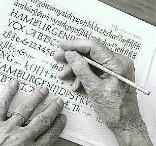
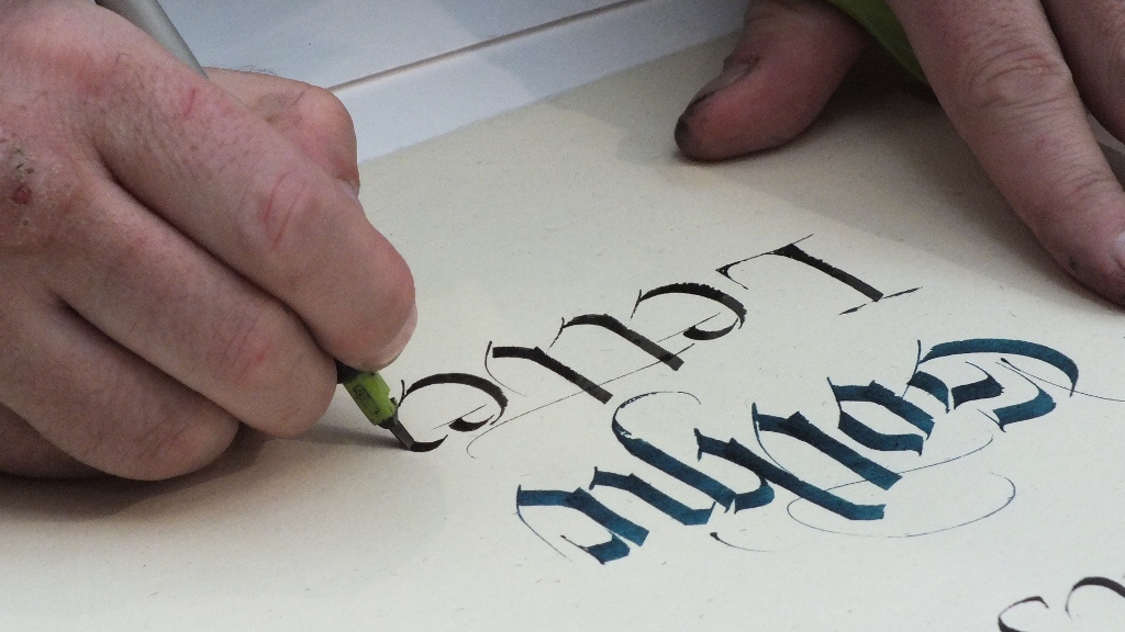
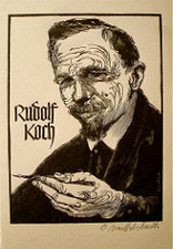
39) 'Calligraphy' = beautiful writing, derived from the Greek words kalli and graphos. This requires an understanding of formal penmanship and a respect for traditional materials and tools. Great calligraphers include: Rudolf Koch, Imre Reiner, Berthed Wolpe, and Herman Zapf.
2/5/16
40) Coated Paper - term for printing papers that have their surface coated with a fine layer of china clay. These coated papers are excellent for printing fine Halftone and color reproductions.
2. Collotype - Photomechanical printing process for finely detailed repos. The surface is prepped with light-sensitive emulsion of gelatin on a sheet of plate glass, then dried in an oven.
3. Colophon - publishing term which identifies the printer, publisher details, dates, fonts, etc
PS short keys
comm + Z = undue
comm + D = deselect
11/13 - Because PS is so complex, there are often several ways to do the same task.
- PS menu commands often involve drilling down from a menu to more submenus, for example: Image>Adjustments>Black and White
- Mac Mod Keys+ command, option, control or shift.
- When you use the mod keys, you need to hold down the key while you mouse click or drag and then release.
- Photoshop Elements - Less expensive and much more simple than the full PS CC version.
- Monitor resolution - should be at least 1024 (H) x 768 (V) pixels to see all items.
- Color Depth - stes how many different colors your monitor can display. For most PS images should be set to millions of colors, also known as 24-bit color = true to the photograph.
2) Use the workspace switcher menu.
3) Manipulate and customize panels
4) Zoom tool, hand, navigator, undo, history, help, tools.
5) Workspace = panels, menus, and shortcuts
6) Menu = bar at top of workspace
7) Docks = columns along sides of app or workspace with tools
8) panels = groupings that appear on right edge
9) Workspace Switcher: You choose predefined workspace
10)
1. Where did you find the image? Do you have copyright permission using the image?
2. What tabs in Bridge?
3. Save for Web? (all options)
4. Levels? (dialog box)
5. In highlight or shadow adjustment, what is clipping?
6. What tool auto calculates angles? (rotate tool)
7. Image midtones of an image?
8. What is the KEY of an image?
9. The graphic chart for an image range of tones?
10. Histogram? (dark pixels levels 0-64)?
11. Histogram levels of tones?
25 Power Tips/ Shortcuts
1) Consider adjusting photoshop preferences. (Number of undos, available ram, etc.)
2) Keyboard shortcuts- E - eraser, L - lasso, hold down shift = letter to cycle through nested tools.
3) Scroll and use zoom tool - spacebar + command key. To drag let go of command key.
4) Command or Control key + or - will zoom in or zoom out. Command + 1 or Control + 1 will zoom document into 100% of its normal size, Command + 0 or Control + 0 will zoom in to fit the screen.
5. Control + R is ruler, right click in the gray of the ruler, and adjust ruler measurements.
Photoshop Topics Covered
Identify the major regions of the Photoshop workspace.
Use the Workspace Switcher.
Manipulate and customize panels.
Open and navigate a Photoshop document.
Explore Photoshop Help.
Create a simple layered Photoshop document, and printer resolutions, and understand when to use each measurement.
Distinguish between appropriate resolution or print ad for Web or email images.
Print a Photoshop document by configuring the Print dialogue box.
38) 23. 2/1/16 -
1. CAD: computer aided design;
2. CAMEO: term applied to a Typeface in which characters are reversed white out of a solid or shaded background;
3. Camera-ready: generic term for artwork that is ready for reproduction by the process camera prior to printing;
4. Capital letters: term is from their use as inscriptional lettering on the capitals of Roman columns. In typography use it's called 'caps' and upper case.
2/3/16
39) 'Calligraphy' = beautiful writing, derived from the Greek words kalli and graphos. This requires an understanding of formal penmanship and a respect for traditional materials and tools. Great calligraphers include: Rudolf Koch, Imre Reiner, Berthed Wolpe, and Herman Zapf.
2/5/16
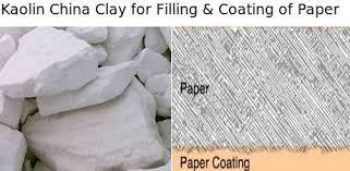
40) Coated Paper - term for printing papers that have their surface coated with a fine layer of china clay. These coated papers are excellent for printing fine Halftone and color reproductions.
2. Collotype - Photomechanical printing process for finely detailed repos. The surface is prepped with light-sensitive emulsion of gelatin on a sheet of plate glass, then dried in an oven.
3. Colophon - publishing term which identifies the printer, publisher details, dates, fonts, etc
- Adobe Photoshop is the industry standard software for image editing. It is both very powerful and very complex… as you learn to master its complexity, you will discover that PS is a magical program.
- Use PS to:
- Adjust scanned or digital camera images for better screen display or printing. PS lets you easily change the file format of images to use in email, web page, or printed documents.
- Edit photos taken with a digital camera or scanner, PS becomes an electronic darkroom.
- Restore old and/or damaged photographs
- Modify images or start from scratch to create original artwork. PS becomes an electronic playroom for painting with pixels.
PS short keys
comm + Z = undue
comm + D = deselect
11/13 - Because PS is so complex, there are often several ways to do the same task.
- PS menu commands often involve drilling down from a menu to more submenus, for example: Image>Adjustments>Black and White
- Mac Mod Keys+ command, option, control or shift.
- When you use the mod keys, you need to hold down the key while you mouse click or drag and then release.
- Photoshop Elements - Less expensive and much more simple than the full PS CC version.
- Monitor resolution - should be at least 1024 (H) x 768 (V) pixels to see all items.
- Color Depth - stes how many different colors your monitor can display. For most PS images should be set to millions of colors, also known as 24-bit color = true to the photograph.
- SRJC Student Learning Outcomes:
- 1. Demonstrate competency in identifying Photoshop interface elements.
- 2. Construct simple documents utilizing selections, layers and blending modes
- 3. Differentiate between simple graphic file formats and choose the appropriate usage for each
2) Use the workspace switcher menu.
3) Manipulate and customize panels
4) Zoom tool, hand, navigator, undo, history, help, tools.
5) Workspace = panels, menus, and shortcuts
6) Menu = bar at top of workspace
7) Docks = columns along sides of app or workspace with tools
8) panels = groupings that appear on right edge
9) Workspace Switcher: You choose predefined workspace
10)
- PS SHORT KEYS:
- comm + Z = undo
- comm + D = deselect
- comm + 0 = fit all to screen
- comm + T = transform or resize selection
- comm + (S,N, O, etc.)
1. Where did you find the image? Do you have copyright permission using the image?
2. What tabs in Bridge?
3. Save for Web? (all options)
4. Levels? (dialog box)
5. In highlight or shadow adjustment, what is clipping?
6. What tool auto calculates angles? (rotate tool)
7. Image midtones of an image?
8. What is the KEY of an image?
9. The graphic chart for an image range of tones?
10. Histogram? (dark pixels levels 0-64)?
11. Histogram levels of tones?
25 Power Tips/ Shortcuts
1) Consider adjusting photoshop preferences. (Number of undos, available ram, etc.)
2) Keyboard shortcuts- E - eraser, L - lasso, hold down shift = letter to cycle through nested tools.
3) Scroll and use zoom tool - spacebar + command key. To drag let go of command key.
4) Command or Control key + or - will zoom in or zoom out. Command + 1 or Control + 1 will zoom document into 100% of its normal size, Command + 0 or Control + 0 will zoom in to fit the screen.
5. Control + R is ruler, right click in the gray of the ruler, and adjust ruler measurements.
Photoshop Topics Covered
Identify the major regions of the Photoshop workspace.
Use the Workspace Switcher.
Manipulate and customize panels.
Open and navigate a Photoshop document.
Explore Photoshop Help.
Create a simple layered Photoshop document, and printer resolutions, and understand when to use each measurement.
Distinguish between appropriate resolution or print ad for Web or email images.
Print a Photoshop document by configuring the Print dialogue box.
|
|
3/2/16 constructivism - radical russian art movement which developed shortly before the bolshevik revolution in 1917 in an attempt to redefine the role of artist and contribute to the construction of a new communist state a group of artists rejected the art for art sake concept underpinning suprematism and directed thier energies to socially useful activity like industrial graphic and theatre design
3/10 - Corporate Identity: Process whereby the design elements of an organization are utilized to maximum effects in order to communicate what it does and how it does it. This can embrace products, services, environments, and the means of internal and external communication. Application of the C.I. is often controlled by a Design Manual. The first C.I. was for German company AEG, an electrical company 1907.
3/8/16
43) Cooper Black is a popular Roman type face made by American type designer Oswald Cooper in 1921. Based on early 19hC ad styles and Coopers other Roman type. The sheer bulk of it means that the enclosed inner spaces (counters) of each letter are very small. The weight requires that it be used sparingly and for Display purposes only.

|
|
3/14 - Cubism art movement that emerged in France about 1906-1909. Pablo Picasso and George Braque, it evolved from the theories and later work of Paul Cezanne. ‘Analytic’ cubism (1909-12) abandoned traditional perspective to explore the multidimensional facets of an object rather than express it in a flat two-D manner. Color and application of Collage emphasized the ‘idea’ of the object.
|
4/1/16
Desktop Publishing(DTP) these software packages allow the user to manipulate type/images on a computer screen. A document layout can be viewed as it would appear on paper, allowing the designer to produce artwork without thinned for manual assembly. This includes multimedia (video,sound) users operate in a digital chain of computers and software.
Desktop Publishing(DTP) these software packages allow the user to manipulate type/images on a computer screen. A document layout can be viewed as it would appear on paper, allowing the designer to produce artwork without thinned for manual assembly. This includes multimedia (video,sound) users operate in a digital chain of computers and software.
- 4/5/46
- De Stijl: dutch are movement and magazine originated by the painter and designer THeo van doesburg in 1917, De Stijl which influenced the avant garde in the 1920s was committed to a unity of the ares. Attracivng artusts deisgners, the movemnt sougnt an abstract objectivity throught the use fo teh rectangle and reliance of primary colors with black and white and gray
- 4/7/16
- Drop cap: Initial letter of the first word in a text setting which because it is set in a larger size, extends into the lines of type below. Also referred to as a dropped initial.
- 4/11/16
- Egyptian: Generic term for a range of heavy Slab Serif Typeface designs. Primarily intended for Posters and Advertising, the types of posters and advertising, the types display little variation of weight between the slab serifs and the vertical strokes. when first shown in 1815, they were referred to as antique.
